Vidiv: Conversational Agents
From technical proof of concept to consolidated product
When Vidiv Events failed to find product-market fit, the team didn’t start from scratch. Years building WebRTC infrastructure and low-latency audio and video delivery left a valuable technical foundation. With it, they developed a proof of concept: a voice-based conversational AI agent.
The response from early clients confirmed there was something there. The question was how to turn it into a product.
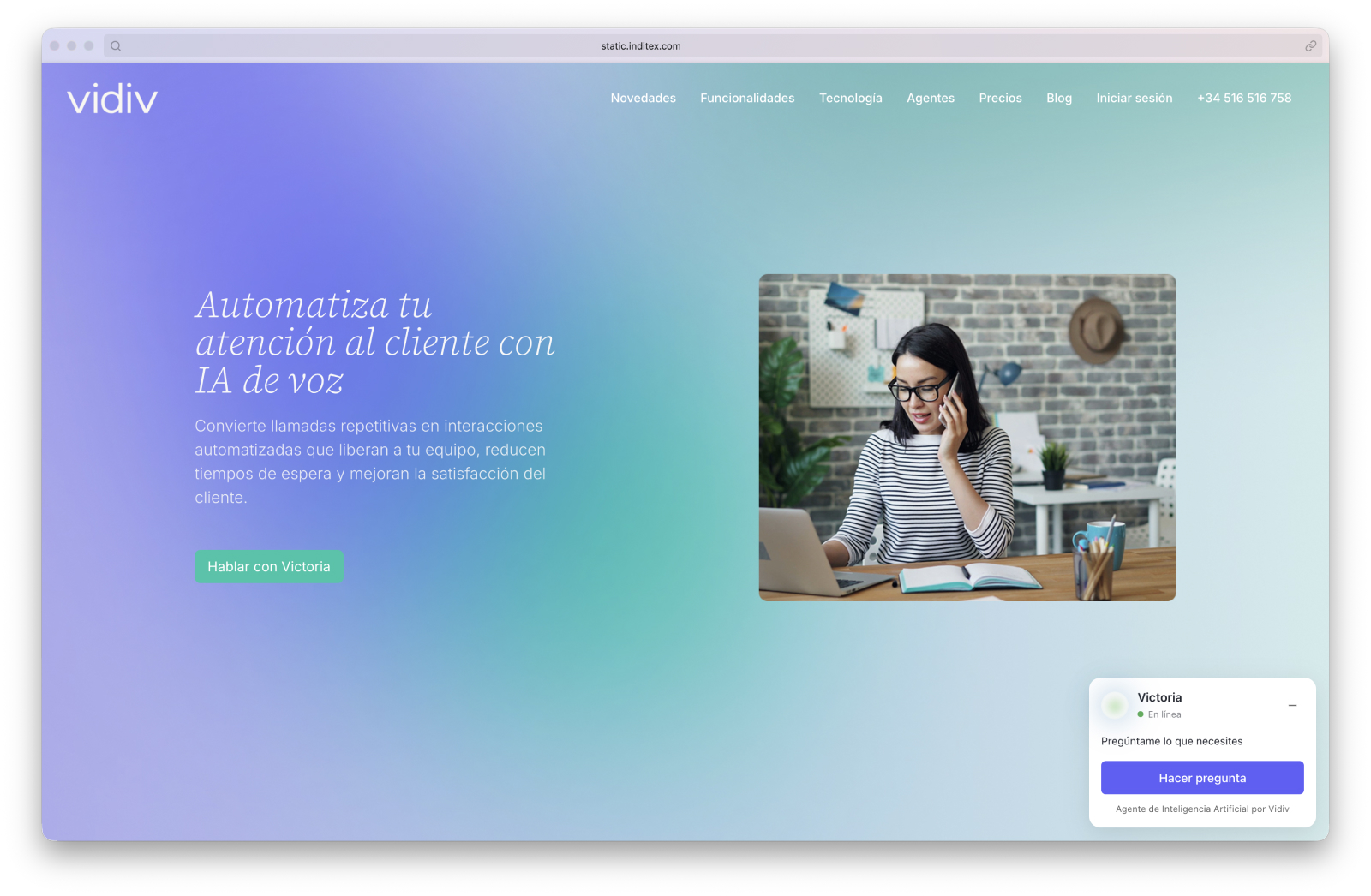
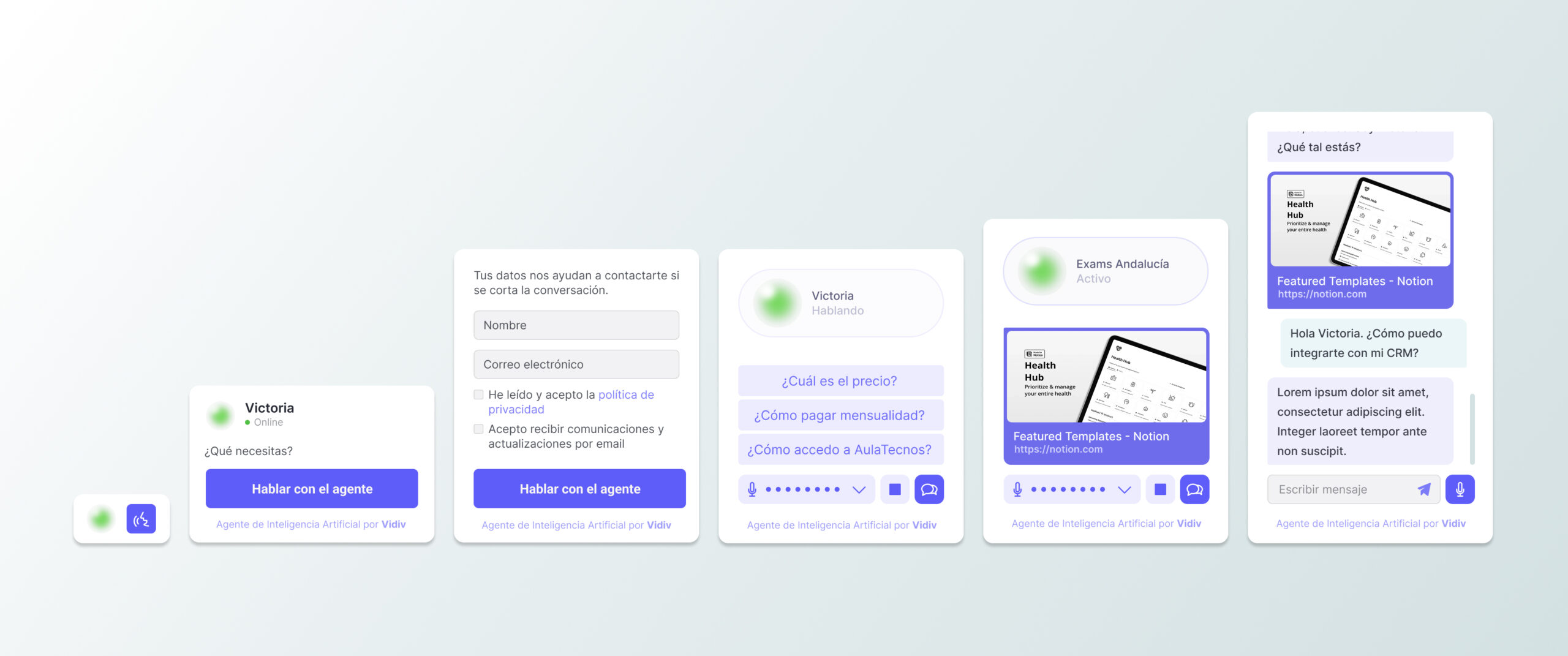
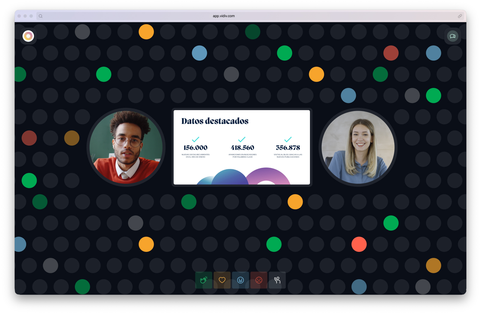
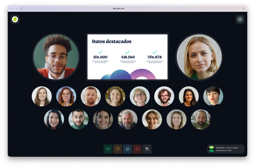
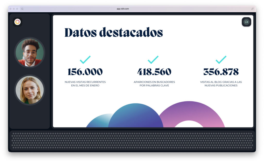
Together with Iria Maceira, we designed the solution in two layers. The first, an embeddable widget for client websites — the point of contact between the agent and the end user.
The second, a control panel for the technology partners managing the platform: agent creation, integration with client systems, and a set of technical parameters we discovered were necessary as we used the tools ourselves and gathered feedback from partners — LLM model selection, temperature, Top P, verbosity, STT and TTS providers. Building those tools forced us to understand them deeply.
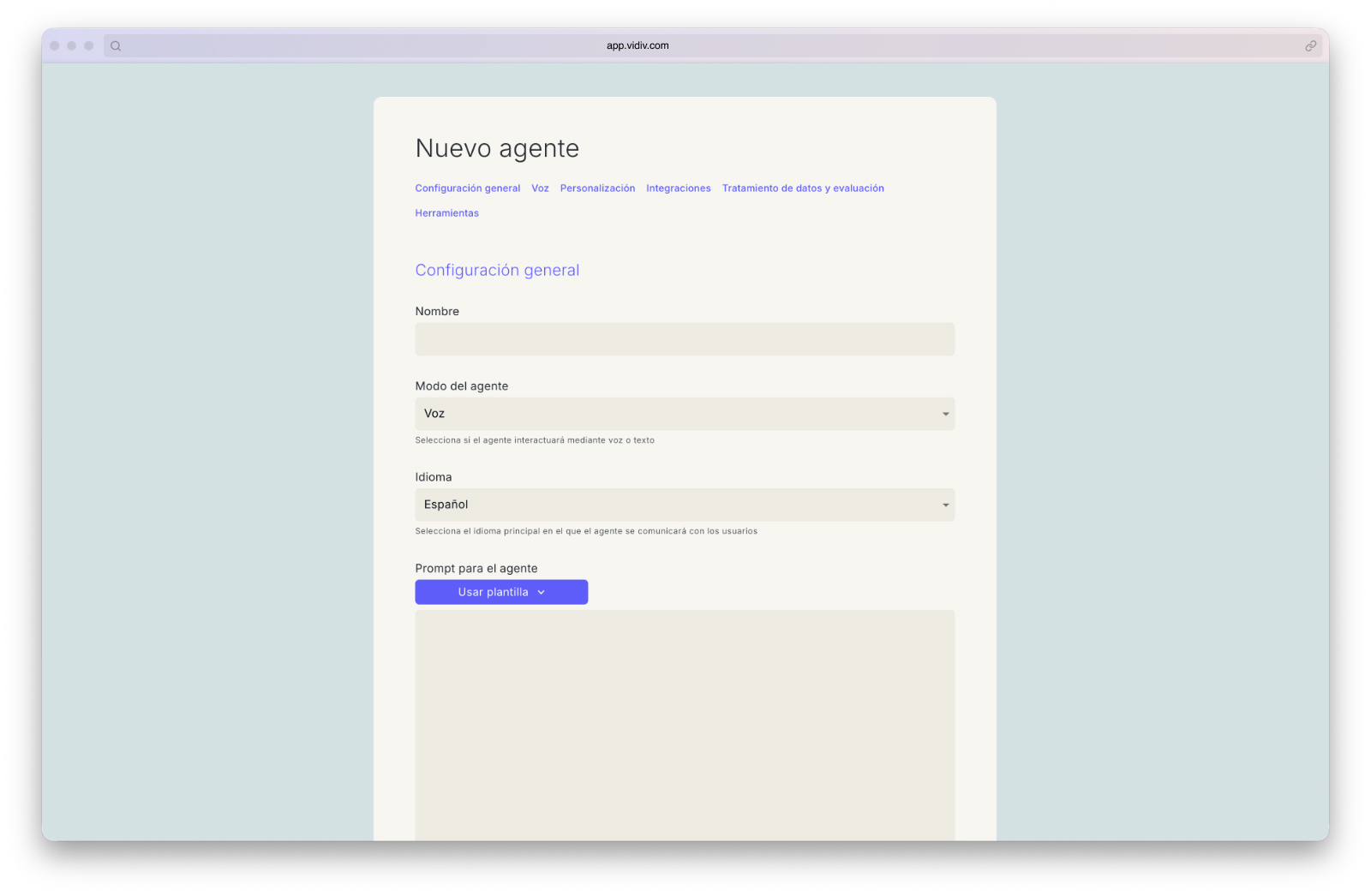
We also added visual customisation layers so the widget could integrate seamlessly into each client’s brand, along with the functionality required to comply with GDPR.
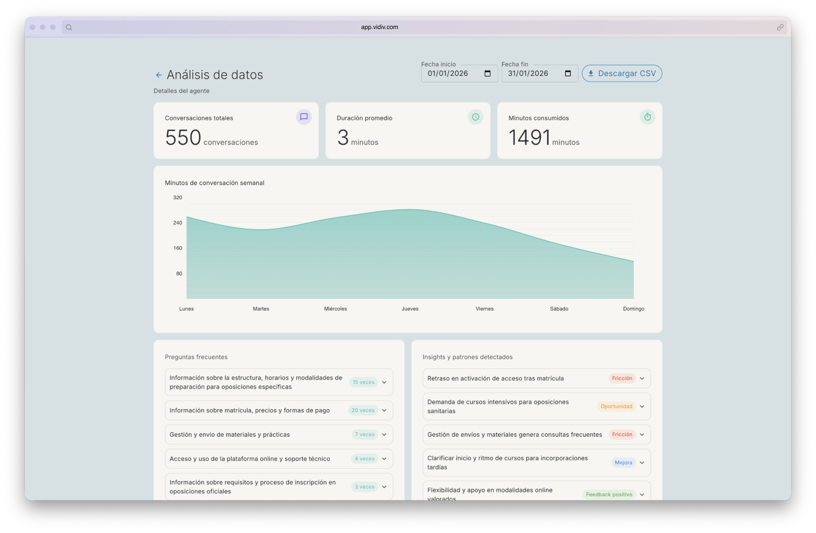
Finally, we designed an analytics dashboard for clients. Beyond usage metrics, conversations were automatically processed to surface qualitative insights: recurring topics, the most frequent questions, users’ real concerns — information clients could use to improve their agents and better understand their audience.
When the development team lacked capacity, I built tools using vibe coding. The most critical was Tecnoszubia, a knowledge base management platform for conversational agents that I built in 3 days to save a churning client. It later became a core platform feature. I also built other internal tools to streamline team processes and agent generation.
Role: Head of Product & Operations · Product Maker · Design Lead
Team: Iria Maceira, Design. Miguel Pérez, Full-stack.
Visual MS: corporate Identity redesign
The redesign that needed consensus before design
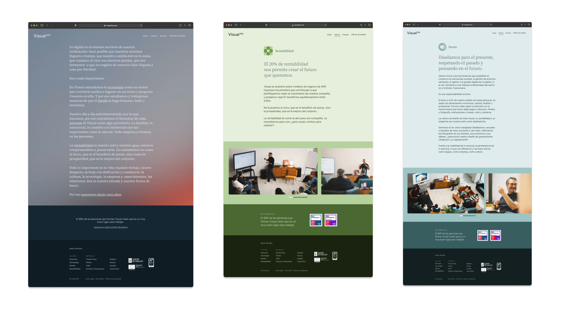
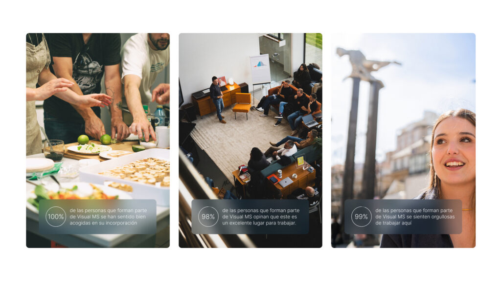
The incorporation of Instituto Tramontana into the Visual MS group created an identity tension that was hard to ignore. Tramontana had a humanistic and emotional approach, centred on people. Visual MS, on the other hand, had built its identity around practicality and minimalism — an aesthetic that over time had become too cold. The two brands couldn’t coexist under the same umbrella without resolving that contradiction.
It wasn’t the first attempt at a redesign. Previous efforts had failed because stakeholders had never been aligned around a shared direction.
This time, the process was as important as the outcome.
As Head of Design, my role was creative direction and project management: establishing the process, reducing friction, and building progressive consensus with all stakeholders. The design execution was led by Iria Maceira, whose work was fundamental to bringing the system to completion.
The most significant decision was not to change the logo — a conclusion reached after exploring and discarding external proposals that didn’t understand the brand, and that required convincing people with very different criteria.
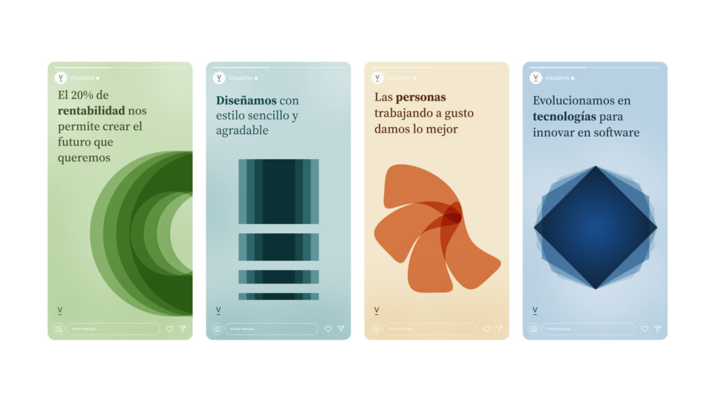
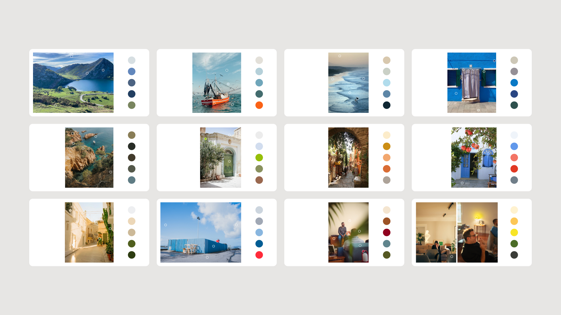
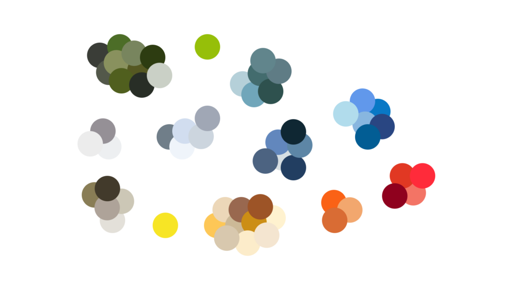
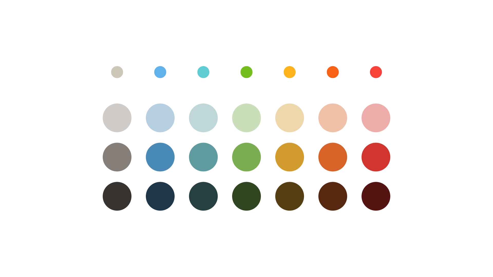
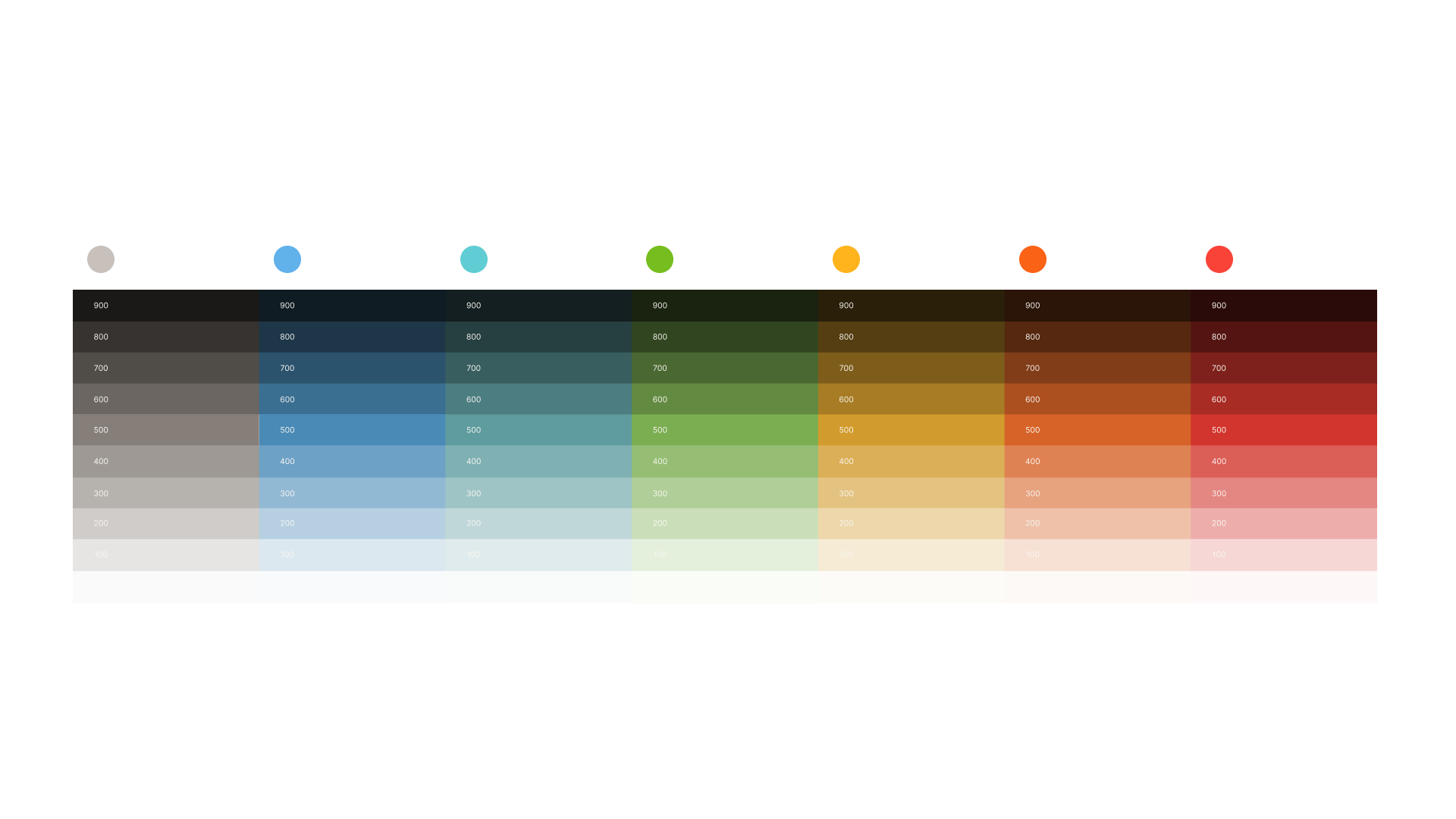
The resulting system was built on decisions with their own internal logic. Colour was drawn from the shared territory of Galicia and Asturias, the palette extracted from the Atlantic and Cantabrian landscape.
The typography — Inter and Source Serif — was chosen for practical reasons: both available on Google Fonts, ensuring consistency across the group without relying on external licences. Inter reflects the practical side of the brand; Source Serif provides the more human, emotional counterbalance.
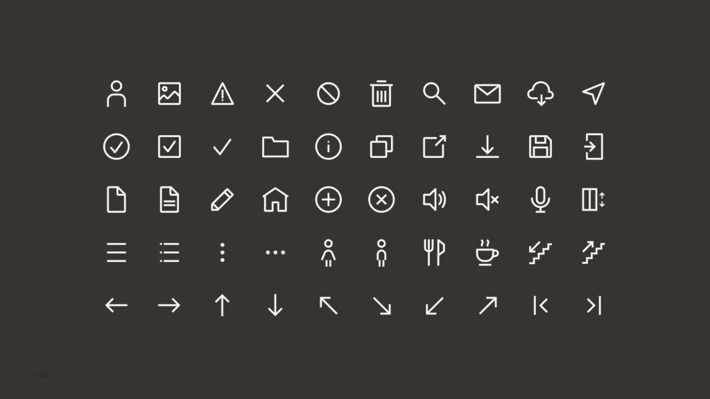
The icons were designed on a 32×32 pixel grid with a 2px stroke. When scaled to 24 pixels, the stroke becomes 1.5px — a visual balance that makes them precise without feeling heavy.
Role: Head of Design.
Team: Iria Maceira, Design. Daniel Cruz, Photography and Video.
Vidiv Eventos
From zero to product during a pandemic
Vidiv Events was born in 2020 to solve a specific problem: large-scale online events were cold, one-directional and dehumanising. Hundreds of people connected, but with no real presence.
The proposal was radical in its simplicity: represent each attendee as a circle in a shared space. An emotion pad allowed real-time reactions, and the circles changed colour according to the group’s emotional state — making visible something that traditional webinars kept hidden: the mood of the room.
We iterated, adding features that deepened that sense of connection: a raise-hand function to involve attendees in the conversation, chat, and the ability for speakers to share contextual links in real time.
Over time we identified that training was the strongest use case. That led us to redesign the space to adapt dynamically to group size: in small events we showed attendees’ faces or video feeds, increasing intimacy. In large events, the space prioritised content over individual presence.
Role: Senior Product Designer
Inditex
Annual Report online · 2013–2016
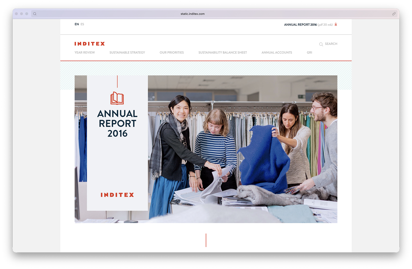
For four consecutive years I designed and led the development of Inditex’s Annual Report in digital format. Each edition arrived in print with the clock already running: interpret, adapt and publish — with no margin for error.
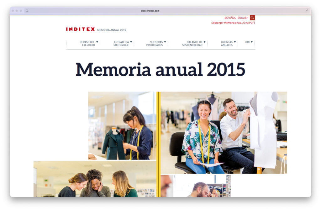
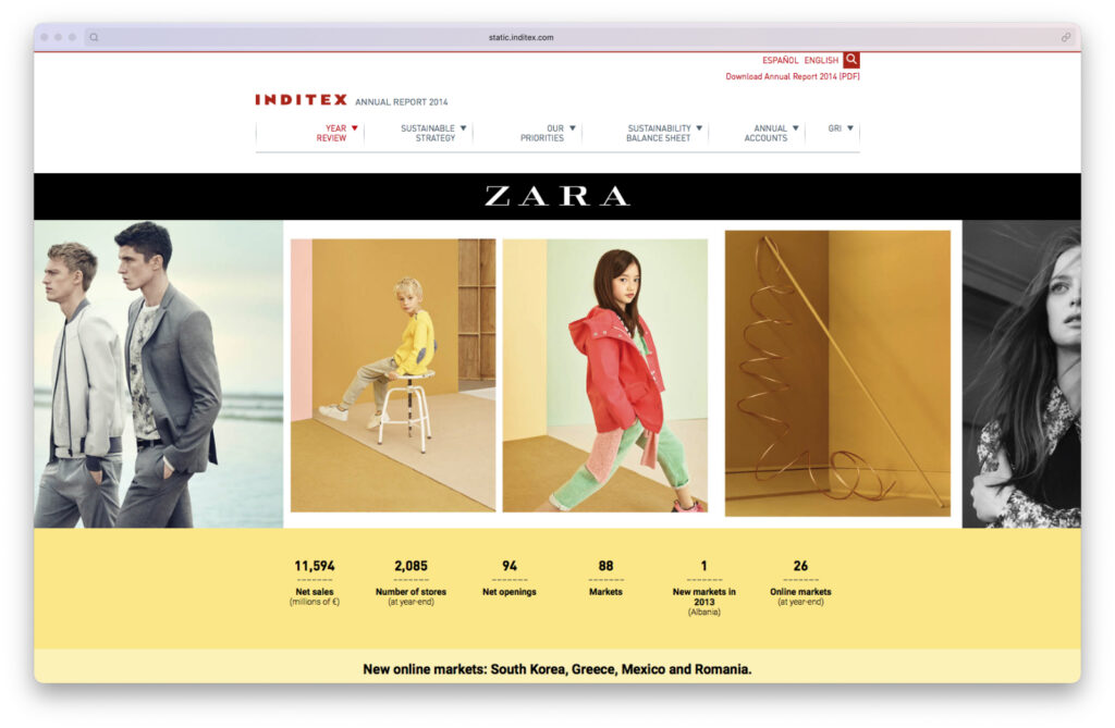
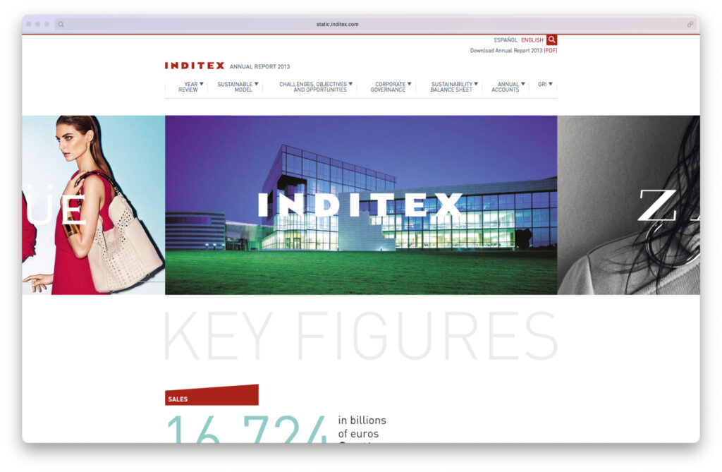
A project demanding editorial judgement, the ability to execute under pressure, and consistency year after year for one of the world’s largest fashion groups.
Role: Project Manager · Senior Designer
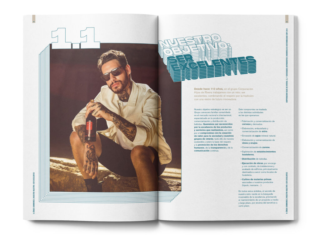
Hijos de Rivera
Sustainability Report 2015 · Online / Sustainability Report 2019 · Print
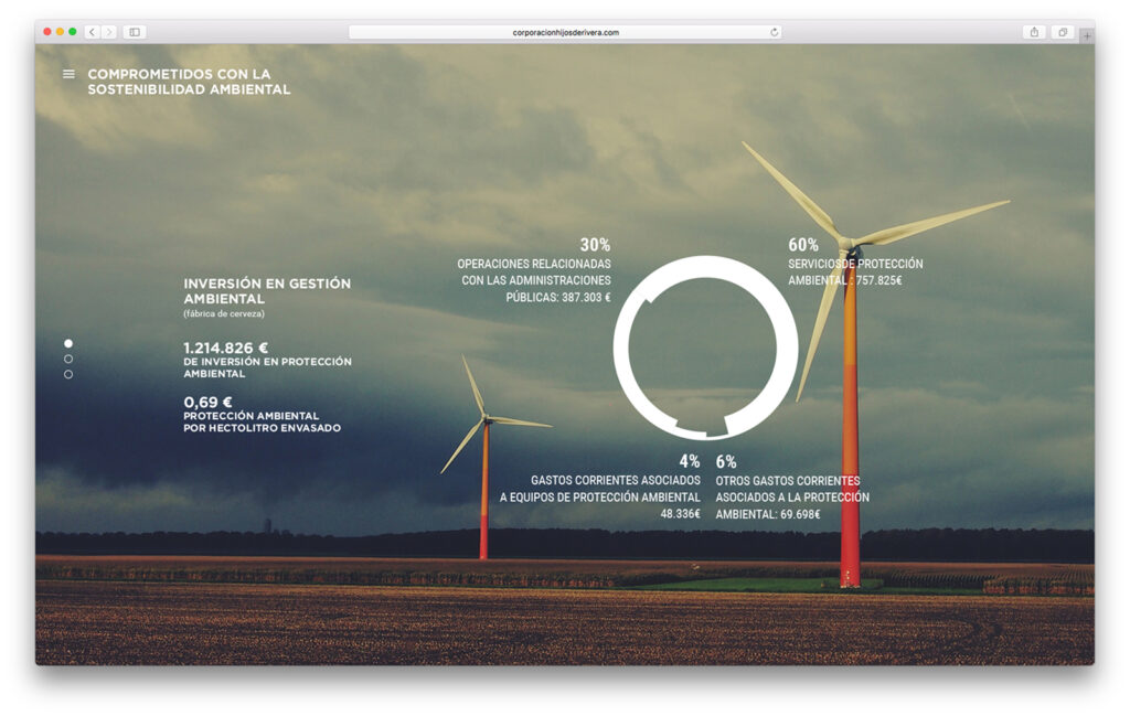
Two sustainability reports for Hijos de Rivera — makers of Estrella Galicia and Agua Cabreiroá — separated by four years and by medium: the first digital, the second print.
In 2015 I handled design, art direction and development management for the online version. In 2019, design and art direction for the print edition.
Two different contexts, the same judgement applied to different languages.
Role: Project Manager · Senior Designer
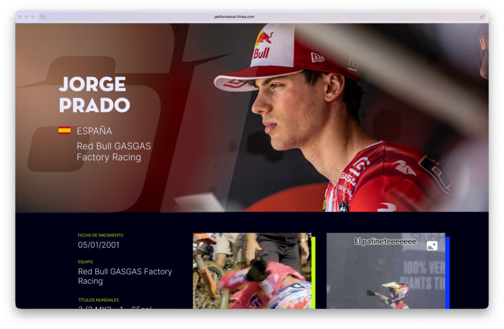
Frinsa Performance
Web for canned food designed for athletes
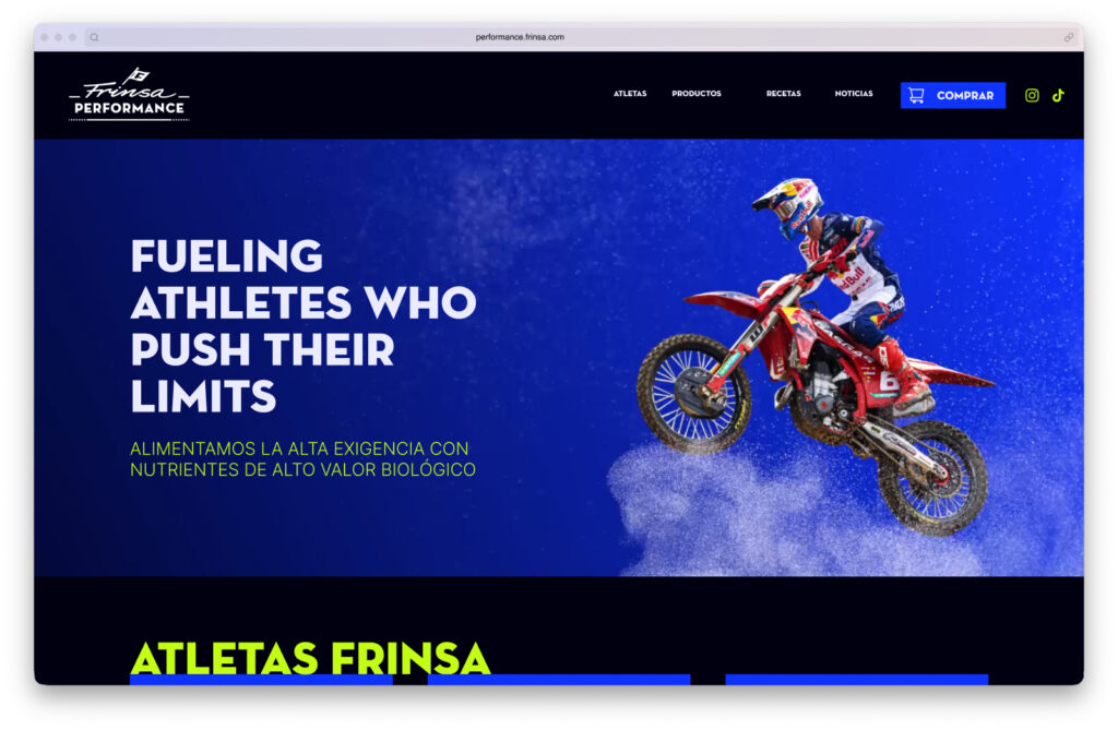
Frinsa Performance was Frinsa’s push into a very specific segment: high-performance athletes. Canned goods with high protein value as the product, and Jorge Prado of the Red Bull team as the face of the brand.
The design challenge was clear: connect with a young, sports-oriented audience without breaking Frinsa’s established identity. The solution was to take the corporate blue and pair it with a vibrant yellow, adding dynamic elements that aligned the site with the energy of competitive sport.
The site brought several worlds together: sponsored athletes with their social media and collaborations, recipes built around athletic performance, and dedicated product pages for each reference — all coexisting within a coherent visual system.
Role: Senior Designer
Nortempo
Job portal for temporary work
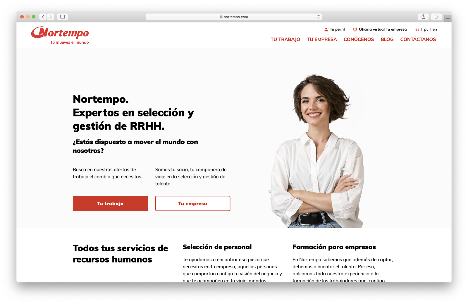
Nortempo needed its own employment platform — built specifically for its network of temporary workers, not a generic profile on an external job board.
I designed both the corporate website and the full portal: active job search, personal candidate profiles accessible to Nortempo’s recruiters, and flows adapted to the dynamics of temporary employment. The project involved close coordination with the external technology consultancy developing the application, managing design criteria and product decisions jointly.
Role: Senior Designer