Post content
Soundtrack: Tobimasu by Hako Yamakasi
–
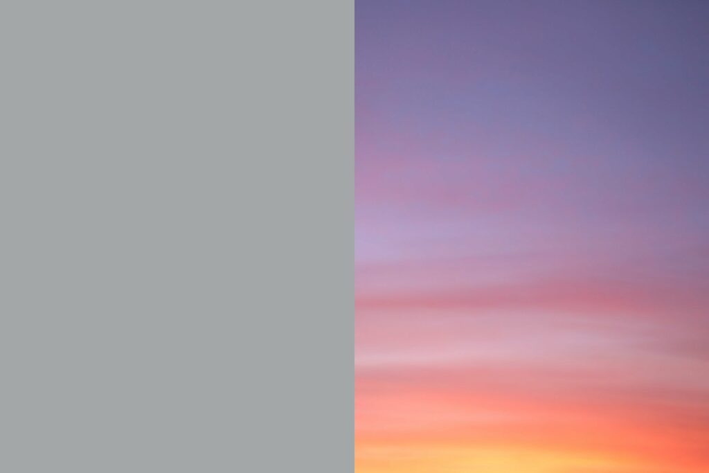
"But then I thought, «Oh, simplicity. What would that be like on a beach? What if the sky was 41 percent gray? Wouldn't that be the perfect sky?» I mean that simplicity sky. But in reality, the sky looked like this. It was a beautiful, complex sky.
You know, with the pinks and blues. We can't help but love complexity. We're human beings: we love complex things. We love relationships — very complex. So we love this kind of stuff".
– John Maeda, Designing for simplicity, TED2007
A 41% gray sky
In 2006, John Maeda publishes The Laws of Simplicity, a small book where he establishes 10 guidelines to reduce the complexity of things. Whether objects or processes.
However, despite what the title might suggest, Maeda is not dogmatic at all and accepts complexity as part of our lives. As in chapter 9:
"Law 9 / Failure: Some things can never be made simple".
In that fragment he doesn't talk about skies, but about flowers:
"Concentrate on the deep beauty of a flower. Notice the many thin, delicate strands that emanate from the center and the sublime gradations of hue that occur even in the simplest white blossom. Complexity can be beautiful."
However, it seems that some designers (I include here architects, engineers and related professions) fall trapped by the simplicity trap. Transforming it into a minimalist anxiety that aims to eliminate any emotion from the designed object/process.
Why do we assume as "better designed" that which is sober, austere and devoid of feeling?
Perhaps because we feel the rational as a unique quality of humans. A capacity that elevates us intellectually and distances us from animals: the more we want to distance ourselves from them, the more we insist on giving prominence to reason, undervaluing the emotional.
It is the control of feelings that prevents us from falling victim to our urges. To the visceral part that all people share, regardless of our origin. And which, despite everything, as Dan Ariely demonstrates in Predictably Irrational, takes advantage of any crack to win the game. Even if that victory over the rational is the result of a couple of beers.
But emotions are also what make us human. Our emotional palette is much richer than that of animals. A dog, a rabbit, a mouse... feel happiness, fear, rage... but they don't reach the complexity and subtleties of all the emotions we experience.
In fact, the seventh law that Maeda proposes is:
"LAW 7 / Emotion: More emotions are better than less."
So, why do we insist on eliminating them from the designed object?
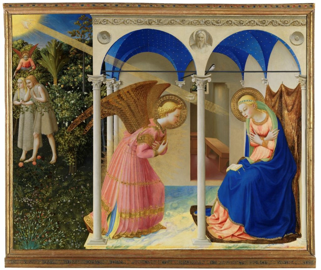
"Similarly, the structure that houses The Annunciation was among the first to follow the recommendation given in 1425 by Brunelleschi for the altarpieces of San Lorenzo, which should be square and without ornaments."
– Miguel Falomir, Italian Renaissance painting: guide, Prado Museum
Hundreds thousands of years ago we were already establishing rules to rationalize "design". Nowadays complexity has increased, as have the reasons to justify our decisions: grids, cognitive processes, market studies, psychological, sociological... Which, in part, transfers the decision-making power from designers to information and collected data: this button has to be red #f51406 and not #dd2222 because it gets more clicks.
I can't imagine Fra Angelico choosing the peaceful color palette (peaceful except for that BLUE, which seems to anticipate Klein blue) of The Annunciation based on psychological studies and doing A/B tests to decide whether to use gold leaf or not. Emotion, intuition and craft were his companions in the search for beauty. His beauty.
The objective versus the subjective, the functional versus the beautiful.
A good instrument
As Don Norman says in Emotional Design, a great designer is one who creates pleasurable experiences. He exemplifies it with the sensations produced by a car, its finishes, acceleration... according to him, experience is critical as it determines the depth with which people remember their interactions.
The greater the emotional charge of an experience, the more memorable it will be: "more emotions are better than less".
Norman continues explaining how people emotionally connect with everyday objects. These connections are complex and affect the product experience with different results. They are also, so to speak, bilateral.
If the person is previously stressed or if the product stresses them, it will produce greater concentration: more focus, less creativity... sometimes generating a kind of tunnel effect. Like in moments of frustration when we insistently repeat the same steps thinking we're going to get different results.
This is not necessarily negative; sometimes it's necessary to resort to a design that provokes that type of emotion. For example, a strident sound is perceived as a danger warning: it stresses us and predisposes us to act. This way we can calibrate the stress we generate with that sound depending on whether it's to notify that we've been liked or to warn an engineer that a nuclear reactor is overheating.
On the contrary, a product that establishes a positive connection produces a cognitive "high" that makes it easier to use. A happy person will generate more creative solutions when having problems with an interface. If beauty predisposes us to feel good, increasing our happiness, creating beautiful interfaces might be a way to reduce the digital divide suffered by older people.
More beauty. More emotions.
It's necessary to understand the emotional context of users people, but it's also important to know how to create and modify it.
I remember my old bass teacher, talking to me 20 years ago about the importance of having a good instrument. Not so much for the obvious quality difference, but for the emotional relationship you establish with it. A relationship that makes you play better.
That connection works as an emotion generator that improves the cognitive abilities of whoever uses it. And, without doubt, beauty is a powerful emotional catalyst.
Additionally, beautiful things deceive us, making us perceive them as higher quality than they really are.
It's difficult to define beauty to be able to apply it to what we design. What is the necessary ingredient for something to be beautiful and to use it to our advantage?
Can the beautiful be defined?
"He doesn't ask you what is beautiful, but what is the beautiful".
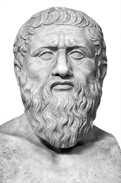
Plato launches into the search for a definition of the beautiful in his Greater Hippias. In the text he personifies Socrates and initiates a discussion with Hippias. Despite the mockery and contempt with which he treats him, it could be qualified more as an inquiry relationship than a confrontation.
During the conversation, different ideas of the beautiful unfold... only to immediately refute and discard them.
Hippias says:
"Socrates, you do not examine the whole of things, nor do those with whom you usually dialogue; you isolate the beautiful or anything else and pounce on it, doing a dismembering work in conversations."
During the dialogue, Socrates proposes three answers to what is the beautiful:
- Beautiful is what is appropriate
- Beautiful is what is useful
- Beautiful is what gives pleasure to sight and hearing
I don't know if these three characteristics define it. But appropriate, useful and pleasurable seem to me qualities of a good product. Whether digital or not.
Socrates closes the Greater Hippias with a proverb: "The beautiful is difficult".
–
A good part of the Interaction Design Program at the Tramontana Institute is based on asking questions. Probably as many or more than answers.
One of them:
Is beauty something inherent to the object or is it in the gaze of the observer?
At the time I was totally convinced that beauty is in the gaze of the observer. But after my last visit to the Prado Museum I'm no longer so sure. The reds used in classical paintings and the blue of The Annunciation made me doubt. How could someone not perceive that beauty?
On the other hand, if there are visceral emotions that we all share, isn't it possible that there also exists a common feeling toward the beautiful?
As Socrates says in the Greater Hippias:
"A strange destiny, it seems, has taken hold of me and I go wandering always in continual uncertainty".
–
This is an extended reflection on a (very brief) paragraph I wrote for the Road to 2030 document by Visual MS in which the company's vision for the coming years is defined.
–
References
Designing for simplicity, TED 2007
The Design of Everyday Objects
The Annunciation at the Prado Museum
Verbal Design Course and Interaction Design Program at the Tramontana Institute