Post content
Soundtrack – Dreams are not enough by Telefon Tel Aviv. Perfect for enjoying with good speakers.
–
If you continue reading, I hope this post makes you think a bit about the hardware that surrounds us. Especially your monitor.
However, I'm going to start with a bit of history about other monitors: audio monitors.
Approximately 100 years ago, audio recordings were beginning to be made. For this, in addition to the obvious need for a microphone and a medium to make the recording, speakers were used that served to validate it from a purely technical standpoint: ensuring there were no strange noises and that the microphone had done its job.
These simple speakers evolved and became increasingly complex. Not only due to the need to improve their quality, but also to develop acoustic experiments. With curiosities like the monitor positioned in real time by Pierre Schaffer's pupitre d'espace (year 1952).
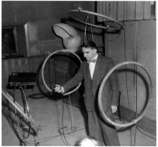
Spatial audio from 70 years ago.
Little by little, the so-called near-field monitors took their current shape. These are designed to be close to the listener and thus provide optimal listening of the original signal. They're not particularly powerful and, ideally, should have a flat response. In this case, the "optimal" thing is that they shouldn't color or falsify the original sound, as the vast majority of commercial speakers do.
Because yes, dear reader, you're not listening to music as the artist intended, you're listening to it as the engineer who designed your headphones/speakers intended.
That's why they conquered the hip-hop world.
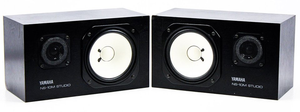
It was in the late 1970s when the Yamaha NS-10 appeared on the market, speakers without great quality, excellent sound, and much less "flat" response.
However, as they say in the industry "if something sounds good on Yamaha NS-10s, it will sound good everywhere."
Myth or not, they have conquered a large part of recording studios over the past decades and remain relevant today. It's more than likely they've been used to produce a good part of your favorite albums: from Springsteen to Bowie to Smashing Pumpkins... and a long etcetera.
Perhaps their flaws are simply complemented by the makeup produced by the speakers that finally reproduce an acoustic work. I don't know, I also haven't found any article that gave me a convincing answer.
Anyway, in a recording studio you won't just find one pair of speakers, but it's common to have several pairs to be able to fine-tune the product so it sounds as good as possible on different devices.
And it's not all high-end speakers, but sometimes a particularly raw sound is sought to put oneself in difficult situations.
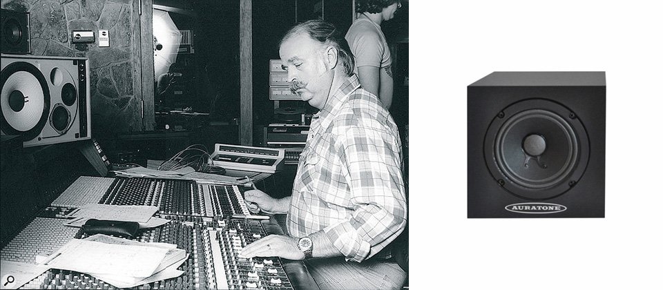
Like Bruce Swedien using Auratones to mix Michael Jackson's Thriller.
Up to the ultimate test: listening in the car to make sure the main elements have good presence even in such a hostile environment. A reality check for the producer that has generated its own memes.

And why am I talking about all this?
Because in the audio world it's completely understood that you have to work for as many devices as possible and, therefore, they use different monitors of various qualities.
However, this isn't the case in digital design. It's rare to find a designer who doesn't use Apple monitors to work. And, even less, one who tests on mid/low-range monitors.
The Apple ecosystem ensures us an excellent screen, good color reproduction, contrast, etc. This excellence in hardware leads us to a certain myopia (metaphorically speaking) causing us, on some occasions, to be extremely subtle and continue perceiving color differences.
However (according to this website), Apple only has a 6.5% market share. Although the percentage increases in the case of iPhones (28%).
Roughly this translates to certain levels of detail in our work only being perceived by a quarter of the population.
But it's not just a hardware issue, software also plays an important role in this.
Recently Iván introduced me to the P3 color profile, its possibilities and limitations in its CSS implementation (I recommend his article on Octuweb). Of all browsers, only Safari is capable of reproducing that gamut (at least at this moment). Apple continues to distance itself from the competition.
Below you can see one or two color bands:
- If you enter from Safari with a Mac you'll see two: the top one with a vivid and powerful tone (P3) and a lower, more muted one;
- If not, you'll only see one, the translation of the color that only displays in Safari (at least at this moment) to the hexadecimal system, more muted.
Perhaps our hardware is distancing us from how users visually experience the products we design.
Who hasn't made a background/line design in gray so subtle that the user then couldn't see it?

Here you can surely see a 0.5 px line in #FEFEFE color.
Just as we assume certain visual flexibility in digital products, we can design assuming that certain elements won't be perceived and act accordingly. For example: a thin line that divides content may be important and we must ensure it has sufficient contrast. Conversely, we could let a subtle background color pass that doesn't have a great impact on design quality.
Perhaps we should look for our Yamaha NS-10s to ensure that a broader part of our audience perceives our design correctly...
...but as someone once told me:
"Everything looks so beautiful on an Apple monitor... 🥺"
–
Just in this Sunday's Honos, Máximo Gavete linked a Twitter thread detailing the W3C's new color contrast system: APCA. Good guidelines for designing in a more accessible way.