Post content
Soundtrack: Scriabin – Etude in C-Sharp Minor, Op. 2/1
–
A few weeks ago I was at the Luis Seoane Foundation in A Coruña, visiting the Victor Moscoso exhibition: Moscoso Cosmos.
In brief: Moscoso is an illustrator/designer of Galician origin who became one of the key figures of psychedelic and underground illustration and comics in the 60s and 70s.
With posters whose vibrant colors seem to clash with each other, like this one:
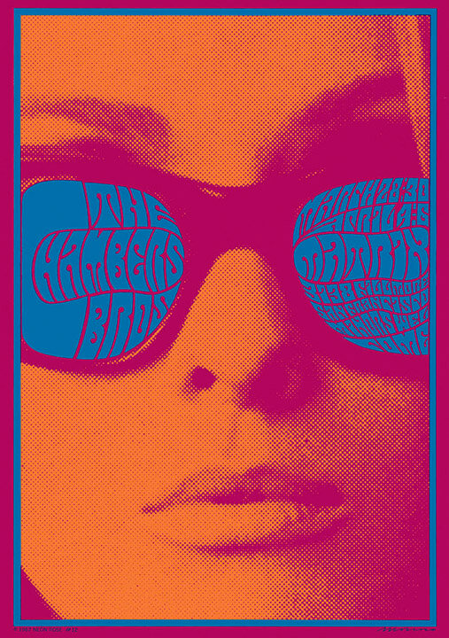
More info in Experimenta magazine.
We can trace the origin of Moscoso's mastery with color to the late 1950s: at that time he was attending the Cooper Union art school in New York, where Josef Albers taught.
Albers, of German origin, studied under the tutelage of Johannes Itten at the Bauhaus when it was located in Weimar… until he became a professor when the Bauhaus relocated to Dessau. It was later, fleeing Nazi persecution, when he moved to New York.
The most remarkable aspect of Albers' work has been captured in his book The interaction of color. In it he distills the theories he has reached through what he learned from practice. In its pages he constantly encourages readers/students to experiment to learn firsthand the different sensations and perceptions that colors produce according to their context and, based on that, draw conclusions.
After the exhibition it was almost a reflex to give the book another thorough review and, in my intention to relate design and sound, several things crossed my mind. I'm going to save some of them for future texts and focus on two:
- What would a psychedelic Moscoso poster sound like?
- According to Albers, color is relative depending on what surrounds it: can this idea be applied to some acoustic element?
–
1. What would a Moscoso poster sound like?
There's no need to reinvent the wheel to answer this question: Moscoso sounds like Pink Floyd, The Doors, Hendrix, Bowie's Space Oddity, Lynyrd Skynyrd, Janis Joplin… any 60s/70s group that pairs well with marijuana or LSD (there's a fantastic Spotify playlist).
Late 20th century stoner would also fit very well like Monster Magnet or Kyuss.
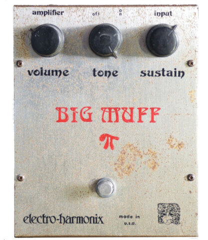
And, if I had to summarize it briefly, it would be a guitar through a fuzz.
2. According to Albers, color is relative depending on what surrounds it, can this idea be applied to some acoustic element?
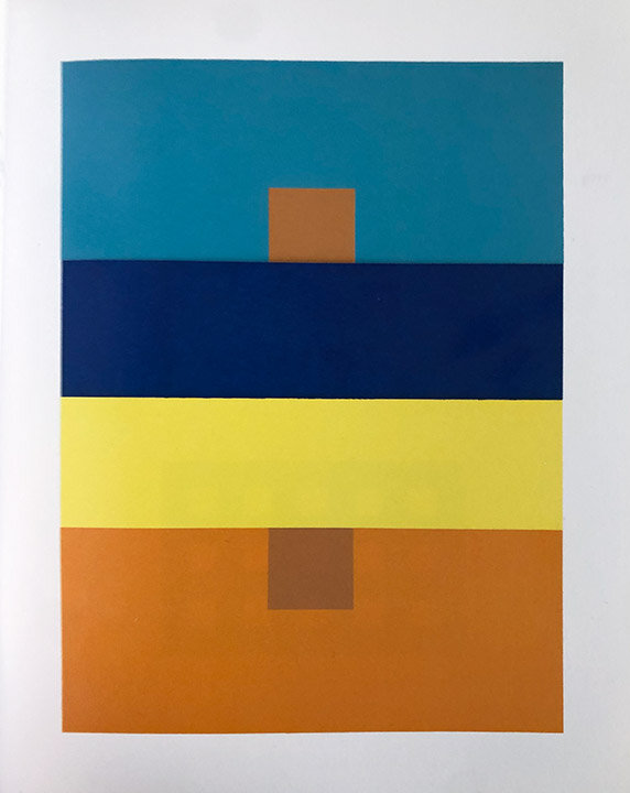
Josef Albers addresses the idea of color relativity in chapter IV of his book:
A color has many faces, and 1 color can be made to appear as different colors. […] Here it is almost unbelievable that the upper small and the lower small squares are part of the same paper strip and therefore are the same color.
And no normal human eye is able to see both squares–alike.
If you don't have it already, it's one of the classics that should be part of your library: here it is on Amazon.
The most complicated part of answering this question (at least from my point of view) is defining which acoustic element we're going to compare with color. It seems extremely complex to me and I'm sure some psychologist or musicologist will have a more adequate answer than mine (if you know it, please write to me).
Personally I'm going to compare tone and color.
Why?
- It's a sensation, a totally subjective perception, an intuition… I don't have synesthesia, but I think of a color and I think of a musical note. With nuances, yes, but I imagine those nuances provided by timbre (I'll address this more deeply in an upcoming text).
- There's a specific form of synesthesia that makes this color/tone relationship: chromesthesia. To the point where Scriabin (Spotify) devised the clavier à lumières: a piano with notes associated with specific colors
- Aristotle, Newton, Goethe, Scriabin, Ostwald, Kandinsky… considered that there exists a correlation between notes and colors, although no common ground has been reached to define a formula for doing so.
- Johannes Itten in his color wheel establishes 12 divisions and coincidentally an octave in traditional Western culture is divided into 12 notes.
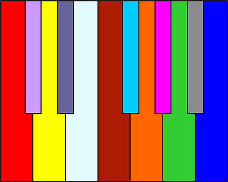
A C minor seventh arpeggio with Scriabin's visualization.
From Wikipedia:
What is color?
Color is the impression produced by a tone of light in the visual organs, or more exactly, it is a visual perception that is generated in the brains of humans and other animals when interpreting the nerve signals that photoreceptors in the retina of the eye send them, which in turn interpret and distinguish the different wavelengths they capture from the visible part of the electromagnetic spectrum.
What is tone?
Tone is the auditory sensation or psychological attribute of sounds that characterizes them as more acute or graver, based on the physical property called frequency.
Starting from these definitions and the base premise, we would still need to define the context which, if we stick to Albers', are the notes/colors that accompany a specific note/color.
The first thing that comes to mind would be a chord, however it doesn't seem correct since it's a mixture of notes that sound simultaneously. Therefore it would be like making a mixture of colors and, really, we would stop perceiving a specific one. We could make another comparison here between additive and subtractive synthesis versus additive and subtractive color formulations (I'm saving this for another post). The examples in Albers' book would be more like arpeggios/sequences of colors that are read as the eye moves through the print.
We then have the question formulated in a more concrete way: does the perception of a note change depending on the arpeggio it belongs to?
As Albers would do, I'm going to get practical by putting an example. However, I'm going to avoid interspersing successions of notes that belong to major and minor chords, since they have a lot of emotional charge and would drastically influence the general perception.
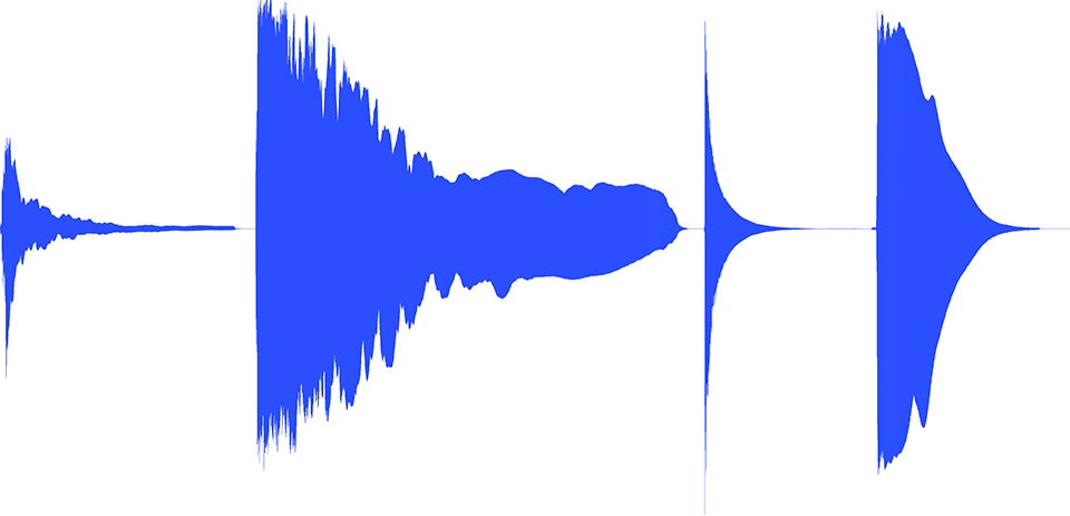
It seems more aseptic to stick to a sequence of notes derived from a chord and some of its inversions. To start from the most basic, I'm going to use the notes belonging to a C major seventh chord (C E G B).
On the other hand, I'm going to use a piano sound with some sustain, so some reader might think:
– It's cheating: with the sustain they will overlap slightly and, therefore, won't be "pure".
I've kept this subtle tail of each note to acoustically recreate the phenomenon of visual persistence. After all, when you "read" one of Albers' examples you do it sequentially, briefly retaining the sensation of the previous color while perceiving the one you're on.
I use the arpeggio to recreate a reading order:
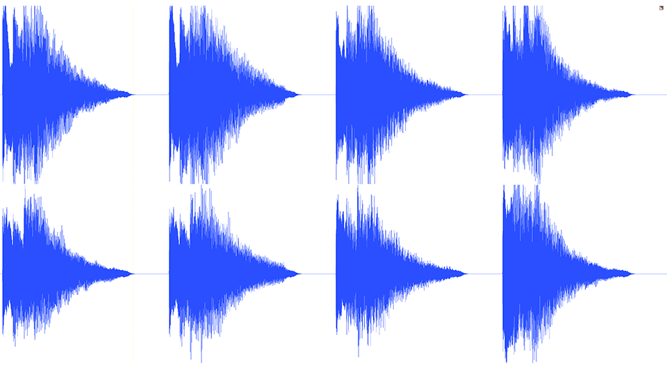
The last note is always the same "C".
Do you perceive it differently depending on its context?
–
Moscoso as a precursor to the GIF.
I would also like to address, more briefly, another topic that impressed me about the exhibition. Such is Moscoso's mastery and command of color, light and printing techniques, that he has managed to produce posters whose colors filter according to the light received, being able to create movement effects with a simple lighting setup.
Said bluntly: printed GIFs.